About
Each keyboard layout claims it is the best because they each use a different metric. Colemak gained a boost in fame when it was declared to be the best in the Carpalx study. Workman claimed to improve on Colemak because it modified the key cap scores used in the Carpalx study by adding a subjective gauge of lateral movement and finger curling preferences to the cap scores. David Piepgrass likened the Asset layout to Colemak, but by declaring Asset to be closer to QWERTY, said it would be better than Colemak. It's also interesting to note that Colemak also advertises similarity to QWERTY.
Norman vs. "the others", the history
Every layout has its strengths. The author of Workman is confident in his key cap scoring model, which if applied to U.S. English yields lower effort scores than any of its competition, however the full optimization of Workman compromises the locations for copy/paste, putting them in less efficient locations for frequent copy operations. Accepting Workman as "fully optimized" also means agreeing with the scores used in the Workman design.
Colemak and Asset are similar layouts, but in the design of Asset, the same-finger assignment from QWERTY is raised as a higher concern in the design. Though Colemak is touted for its supposed ease of switching from QWERTY, Asset keeps 20/26 letters on the same finger, whereas Colemak only keeps 15/26. As the Carpalx study shows, the theoretical loss of efficiency by keeping the QWERTY same-finger design is fractional, perhaps inconsequential.
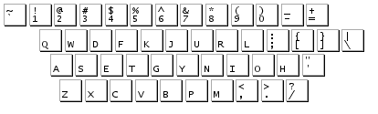
Blue arrows are keys that stayed with the same QWERTY finger in Norman. Green are keys on the same hand, but different fingers, and yellow keys changed to a different hand.
The drastic movement of keys in the Dvorak layout is the main reason Colemak's FAQ cites for Dvorak adoption failure. Efforts to achieve "full optimization" by moving keys all around the keyboard like in QGMLWY, away from their originating QWERTY hand and finger, are also destined to increase the likelihood of adoption failure.
When switching from QWERTY, as a user who types enough to be concerned enough to switch, the loss of productivity in typing speed and in gained frustration is cause to minimize not only the general movement of key caps, but the finite movement to a different hand or finger on the same hand. Maintaining common shortcuts is essential to adoption. The better job you can do at minimizing frustration and productivity loss, the more likely a conversion away from QWERTY will be successful.
What’s remarkable is that with only 12 keys you get most of the improvement of Dvorak at nowhere near the expense of its learning curve. This shows that you don’t need to throw out QWERTY, you just need to fix it.
The importance of common shortcuts and historic link to QWERTY is evident when comparing the overall success of adoption between Arensito, introduced 2001, and Colemak, introduced 2006. Arensito has essentially no resemblance to QWERTY. Colemak has been adopted in the main keyboard options during operating system installs for Apple, Linux, Chromium OS, NetBSD, and FreeBSD. It also has add-on options for just about any other operating system. Arensito is available as an add-on for Windows only.
When trying to improve on any of the available layout alternatives to QWERTY, all the authors of Asset, Colemak, Workman, Arensito, Dvorak, Capewell-Dvorak, Klausler, and Carpalx variants should be considered as they each have slightly different goals and research findings.
I tried for existing layouts after researching them as possible candidates. Here are some of my findings from studying, and trying some of the aforementioned:
Asset
- Asset is so great that six years later, its creator doesn't even use it.
- I think its emphasis on QWERTY similarity has validity based on my experience trying to train to a key shifted to a different finger on the opposite hand.
- When I started designing my own keyboard layout, I independently started with the same 8 keys on the home row as are used with Asset.
Colemak
- Colemak gained popularity to a large degree by advertising similarity to QWERTY.
- The community around Colemak has been very successful in getting it added in feature positions for popular operating systems.
- As OJ Bucao observed when designing Workman, the Colemak layout has a high degree of lateral finger movement to the center column for D and H. I believe the center column should be de-prioritized and not considered part of the "home row."
- Included in freedesktop.org's xkeyboard-config.
Workman
- OJ Bucao is a big fan of the TypeMatrix keyboard, a non-standard, grid style keyboard. When launching www.workmanlayout.com, he even created the feature layout image using the grid instead of a standard staggered design. This likely impacted the design of the staggered scores.
- Workman's model is designed around a score for each key cap.
- The scoring model treats the left hand as equal to the right.
- The keyboard shortcuts for copy/paste are shifted to the right unnecessarily.
- Included in freedesktop.org's xkeyboard-config.
Dvorak
- Dvorak is a huge break away from QWERTY. There is a high degree of frustration and a long period of productivity loss in converting to it.
- Common shortcut keys are shifted around the keyboard and therefore should disqualify it from consideration by anyone if for no other reason, Colemak's wide availability.
- Included in freedesktop.org's xkeyboard-config.
Parameters for Norman
I am right handed. My right hand generally does everything better and faster than my left. My fingers are doing the work, not the key caps. Fingers should be considered, scored by ability and assigned a load, not the keyboard.
My pinkies are slow. On a keyboard, I don't press with my pinky finger independently so much as I hold it stiff and press my entire hand in the direction of my pinky. I use my right ring finger for the delete key.
When I have tried learning alternative keyboard layouts, I find myself using the same finger on the wrong hand (i.e. typing E with my left middle finger in the Workman layout). I think when users are considering alternative keyboard layouts, they've already become proficient with QWERTY. There are deep brain connections after several years of QWERTY typing. Learning a new keyboard layout that shifts keys to different fingers or to the opposite hand as QWERTY compounds the learning curve and increases the chances for conversion failure.
Undo/copy/cut/paste, save, select all, and quit are common shortcuts, which belong on the left hand and are already in optimal locations. They should remain together and on the left hand so copy/paste operations can be performed while mousing with the right hand.
Software developers use common shortcuts, which are universal across applications and operating systems. Undo, copy, cut, paste, select all, and quit should be one of the first things a person uses when using a computer. In fact, they're so important, that just about sums up the only shortcuts to have their own implementations in mobile operating systems like iOS and Android.
Layout design exclusions
Changing the keyboard layout is not a complete solution to preventing repetitive strain injury and carpal tunnel syndrome. There are additions you can make to your injury prevention plan, however I posit the following, which I list as exclusions for consideration in the design of a keyboard layout.
- Grid layouts like TypeMatrix are not likely to be adopted widely by computer manufacturers. TypeMatrix is as expensive as some fully-functional tablet computers. I used to own their 2020 model but sold it before they came out with the 2030. I think their 2030 model does fix some of their earlier design flaws and would be excited for them to implement Norman in some way. I simply didn't consider them mainstream enough to weight in the design of the Norman layout.
- Contoured keyboards like the Kinesis are even less likely to be adopted widely.
- Keyboards with cords are dinosaurs.
- Wireless keyboards like the FrogPad with multiple parts still require significant effort to learn new typing formats.
Goals for Norman
When setting the goals for the Norman layout, there was really only one primary goal:
Find a balance between typing optimization and conversion difficulty.
Super typing speed is not a goal of Norman, but it is a side-effect. Reduced effort is a much higher goal, both in effort to convert from QWERTY and in finger movement. In fact, applying some thought and modern analysis tools to the QWERTY layout can yield speed improvements by simply moving the most common 6 characters to the home row.
It just so happens that the Norman layout almost beats out Workman's efficiency scores in US English using Workman's own scoring model. That said, I do not agree with the Workman scoring model because it rates key caps instead of fingers. I do not think the left hand should be rated equally to the right, however the design of Norman doesn't depend on key cap scores.
When designing Norman, the first task was to find the most frequently used characters in US English that I am likely to type. I am not likely to type any large volume of Alice in Wonderland, as is so commonly used as sample input to analyses. I took a sample of my own writing, 5,755 words using 33,319 characters to decide which characters I type commonly. The Asset layout did a similar study and there are websites like letterfrequency.org that list the outcomes of more generic frequency studies. My frequency outcome was similar to other frequency studies:
etoainsr ldhu cmpgwfybvkxjqz
The spacing was added for emphasis. The Norman layout places each of the most common 8 letters somewhere in the proper home row. Their exact location in the home row is guided by their QWERTY finger. Only the letters T and R were in contention for shifting to an alternate finger. The lesser frequency of R guided it to the weak pinky finger and results in the first of 4 letters to move to a different finger than would have been used in QWERTY. This meant adopting the model of several other layouts like Asset, Colemak, and Workman, to shift semicolon out of the home row and to the even weaker pinky position.
Given my right hand preference, and the guidance of QWERTY fingers, L, U, and H were all able to take prime positions on my right hand in the top row, on strong fingers, and maintain their QWERTY finger. Letter D was able to maintain its QWERTY finger and keep a strong finger on my left hand.
From this point forward, the remaining list of characters is as follows in order of frequency:
mpgwfybkj
Note, the common shortcut keys are not considered in the list. They are fixed in the layout. Regardless of their frequency, their added efficiency by saving typing with their operations, or by not introducing additional finger stretching disqualifies them from moving.
Considering the next letter M, its QWERTY position was already in a location for favoring my right hand on a strong finger. Since P had to shift to make room for the semicolon, I also assigned P to my strong right hand finger.
The process for the rest of the letters follows the same process. Evaluate the letter's QWERTY finger and decide the optimal location for it to be pressed, avoiding the center column as much as possible.
